Examples
The examples directory contains the following examples:
gnuplot
minimal
A (near) minimal example from examples/gnuplot_minimal/minimal.py:
#!/usr/bin/python

from plotbridge.plot import Plot
import numpy as np

p = Plot() # by default, Plot uses
           #   template='gnuplot_2d', (plot) name="plot",
           #   output_dir='.', and overwrite=False

x = np.linspace(0,10,201)
p.add_trace(x, np.sinc(x))

# Generate the output (i.e., the .gnuplot script
# stored in <output_dir>/<plot_name>).
p.update()

# Run the plot engine (gnuplot), i.e., execute the
# plot script generated in the subdir "plot".
# Since the template was 'gnuplot_2d', this will only
# work if you have gnuplot installed!
p.run()

basic 1
From examples/gnuplot_basic1/basic1.py:
#!/usr/bin/python

from plotbridge.plot import Plot
import numpy as np
np.random.seed(123) # makes automated testing easier

p = Plot(name='Test IV', template='gnuplot_2d',
         output_dir='.', overwrite=True)
# You should now have a subdir "Test_IV" in your working dir.

# You can call p.run() immediately,
# the plot will be generated/updated whenever you
# call p.update().
p.run(interactive=True)

p.set_title('Fake IV')
p.set_fontsize(28)
p.set_xlabel('current (nA)'); p.set_xunits(1e-9)
p.set_ylabel('voltage (uV)'); p.set_yunits(1e-6)

current = np.linspace(-5e-9,5e-9,41)
p.set_xrange(-5.5, None) # None means autorange (in this
                         # case, only for the upper bound)

for i in range(2): # add two (simulated) measurements
  # Assume that the ideal response is linear (V = IR).
  voltage = (1 + i) * 3e3 * current

  # Simulate noise (correlated with the absolute voltage).
  errorbars = 0.1*np.abs(voltage)
  voltage += errorbars*np.random.randn(len(voltage))

  p.add_trace(current, voltage,
              yerr=errorbars,
              title='voltage %d' % i,
              lines=False, points=True,
              update=False) # update=True --> same as p.update()
  # each add_trace save the points in a binary file in "Test_IV".

p.update()
# This (re)generates Test_IV.gnuplot in "Test_IV".
#
# p.update() also executes gnuplot_2d.preprocess, although
# it's just an empty placeholder for the "gnuplot_2d" template.

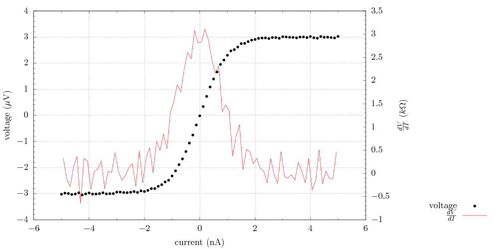
basic 2
From examples/gnuplot_basic2/basic2.py:
#!/usr/bin/python

from plotbridge.plot import Plot
import numpy as np
np.random.seed(123) # makes automated testing easier

p = Plot(name='Test IV', template='gnuplot_2d',
         output_dir='.', overwrite=True)
p.run(interactive=True)

# Export a PDF, this is implemented with epslatex in the template, so
# use LaTex format for all strings.
#
# Note: the on-screen interactive version (wxt) does not support
# LaTeX, but the correctly rendered version will show up in
# Test_IV/output.pdf.
p.set_export_format('pdf')

p.set_title('')
p.set_width(600)
p.set_height(300)

p.set_xlabel(r'current (nA)'); p.set_xunits(1e-9)
p.set_ylabel(r'voltage ($\\mu$V)'); p.set_yunits(1e-6)
p.set_y2label(r'$\\frac {dV}{dI}$ ($k\\Omega$)'); p.set_y2units(1e3)

current = np.linspace(-5e-9, 5e-9, 81)
voltage = 3e3 * 1e-9*np.tanh(current/1e-9) # simulate ideal response
voltage += 0.02e-6*np.random.randn(len(voltage)) # simulate noise

p.add_trace(current, voltage,
            title='voltage',
            color='black',
            lines=False, points=True)

p.add_trace(current[:-1] + 0.5*np.diff(current),
            np.diff(voltage)/np.diff(current),
            title=r'$\\frac {dV}{dI}$',
            color='red',
            lines=True, points=False,
            right=True) # plot this trace on the y2 axis

# Pass plot-specific other options.
# In this case, the legend placement directive.
p.set_other_options({'key': 'outside'})

p.update()
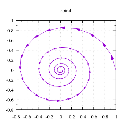
Parametric curve with arrows indicating direction
This is an example where the .preprocess script does something non-trivial.
From examples/gnuplot_with_direction/with_direction.py:
#!/usr/bin/python

from plotbridge.plot import Plot
import numpy as np

p = Plot('spiral', template='gnuplot_2d_with_direction',
         overwrite=True)
p.set_width(300); p.set_height(300)

t = np.linspace(0, 10*np.pi, 101)
curve_in_complex_plane = np.exp(-t/10. + 1j*t)

p.add_trace(curve_in_complex_plane)
p.update(); p.run()
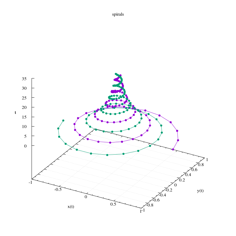
Parametric curves with the parameter on the z axis
From examples/gnuplot_curve_in_3d/curve_in_3d.py:
#!/usr/bin/python

from plotbridge.plot import Plot
import numpy as np

p = Plot('spirals', template='gnuplot_3d',
         overwrite=True)
p.set_width(600); p.set_height(600)
p.set_xlabel('x(t)')
p.set_ylabel('y(t)')
p.set_zlabel('t')

t = np.linspace(0, 10*np.pi, 101)
curve_in_complex_plane = np.exp(-t/10. + 1j*t)

# This interprets the real and imag parts
# as the x and y coordinates
p.add_trace(t, curve_in_complex_plane,
            lines=True)

# You can also specify the components as a matrix
curve_in_complex_plane *= np.exp(1j*np.pi)
p.add_trace([ curve_in_complex_plane.real,
              curve_in_complex_plane.imag,
              t],
            lines=True)

p.update(); p.run()
2D sweep
A typical (noisy) measurement as a function of two sweep parameters from examples/gnuplot_heatmap/heatmap.py.
Another example where the .preprocess script does something non-trivial.
#!/usr/bin/python

from plotbridge.plot import Plot
import numpy as np
np.random.seed(123) # makes automated testing easier

p = Plot('Transmission vs f and B',
         template='gnuplot_2d_stacked_image',
         overwrite=True)

p.set_width(400)
p.set_height(300)
p.set_xlabel('frequency (GHz)'); p.set_xunits(1e9)
p.set_ylabel('B field (mT)'); p.set_yunits(1e-3)
p.set_zlabel('S_{21}')
p.set_zlog(True)
p.set_grid(False)

for bfield in np.linspace(-.9e-3, .9e-3, 51):
  f0 = 1.3e9 - 1e9*np.abs(bfield/1e-3)**2
  w = 30e6
  freq = np.linspace(f0 - 400e6, f0 + 400e6, 101) # Hz
  transmission = 1 / ( 1 + (2*(freq-f0)/w)**2 ) # fake data
  transmission += np.abs( 0.02 * np.random.randn(len(transmission)) ) # fake noise
  p.add_trace(freq, transmission,
              slowcoordinate=bfield)

p.set_xrange(0.4, 1.6) # None, None --> autorange
p.set_yrange(-.8, .8)
p.set_zrange(1e-3, 1.05)

p.update()
p.run()
